
Introduction
RRDtool is primarily a graphing program. The developers refer to it as database program, and it certainly stores data, but I don't think you will trouble with it unless you want to generate graphs. And, the graphs are rather limited. Use it to graph the results of periodic measurements of such things as temperature (which got my interest), humidity, network data, distance, people coming coming and going, speed, daily stock market prices, etc. After spending a great deal of time with RRDtool, I don't believe you could use it to graph something like robberies against midday temperature, or test scores against hours watching TV. In other words, the X axis should be time.

I am blogging about this because I find this tool useful. However, after reading tutorials, reading usage documentation, and reading blogs of others making graphs with RRDtool, I found it difficult to put it all together and get satisfactory results. There are many idiosyncrasies. unexpected results, and pitfalls along the way. I think I mastered the tool, but only after many hours of toil. I want to share what I learned with the Raspberry Pi community.
RRDtool is widely used in industry, but mainly, it seems, by IT departments to track network data and memory usage. As I discuss this tool, it will be apparent that it was designed for that purpose.
Round Robin Databases
RRD in RRDtool stands for Round Robin Database. It's a different kind of database, there are none of the traditional database elements like fields and records. You store time and data. Just numbers. Those numbers relating to time, are weird. If I take a measurement now (September 3, 2013, 4:53:19 PM), the time in the database would be 1378241580.
So what's a Round Robin Database, and why use one? The purpose of this type of data storage is to limit the amount of data stored so your database does not keep growing on you (beyond a certain point). As far as I can see, that is its only advantage. You tell it how much data to store, and when that number is exceeded by new data, the oldest data is replaced by the new data. The "Round" in "Round Robin" gives a visual representation of the process. Picture something round, like a Ferris Wheel, for example. The wheel has a limited number of cars. Let's say we put one piece of data in the first car and the wheel turns to the next car. The next piece of data goes into the second car and the wheel turns again. This process is continued. Eventually, the first car comes around again. Now, if there is new data, it replaces the data already in the car.
Take a look at the sample graph. If it were me doing the plotting, I would connect two adjacent data points with one line that slants from one point to the next. RRDtool does not plot that way, there is a series of horizontal lines from one time interval to the next, then vertical lines from one measurement value to the next. It looks weird if you have few data points like I do in the example. If you have many, many data points, the horizontal lines become very short and the graph looks better.
RRDtool For Python - PyRRD
RRDtool is available for many platforms. For the Pi and Linux, you take the apt-get route (sudo apt-get install rrdtool) . RRDtool is a command line program. While you can write shell scripts to make your work reusable, I wanted to run it within my python programs. Of course, you can issue command line commands within python, but it becomes very cumbersome. There is a good solution, and that is a program called PyRRD 0.1.0 which is a python interface to RRDtool. It seems to have all the functionality of RRDtool.
There is one function of PyRRD that does not work and that is the function called Fetch. This very useful function is used to retrieve the data you have in the database. I have used it frequently as you will see when I show the data in a database. However, I don't use it from PyRRD, but from the command line from RRDtool. Be sure to download both programs. There are many forum posts about this Fetch problem dating back to 2009, but there has not been a solution. It's no big deal issuing fetch from the command line.
PyRRD 0.1.0 is not in the Debian depository so you can't use apt-get command to get the program. You must download it and install it. Go to the PyRRD website for the download file and instructions. If it fails saying it can not find setuptools (not installed with Raspbian) execute the following: wget https://bootstrap.pypa.io/ez_setup.py -O - | sudo python
I spent a great deal of time with the sample program under the website topic "Usage". I wanted to understand every line. After typing commands into Idle's python shell, I decided I needed something reusable so made a python script out of the code. That way I could experiment by making changes and seeing the consequences. If you wish to do the same, change the lines starting with vdef1= and vdef2=. They should end in cdef1.vname not def1.vname.
I followed the instructions in the section labeled "Python Bindings". I could not get this to function. Apparently I'm missing a library . However, things work fine without it.
Documentation You Absolutely Need
In addition to the PyRRD website, please see the RRDtool website. In particular see the tutorial by Alex van den Bogaerdt. Also, see the documentation for the rrdcreate function, and any other function of interest.
Once you have PyRRD installed you need to know the functions available to you and what parameters can be passed into those functions. This information can be gleaned from two python files. With the Debian distribution those files are in:/usr/local/lib/python2.7/dist-packages/PyRRD-0.1.0-py2.7.egg/pyrrd. The file rrd.py has about everything you need for logging data. graph.rrd has everything about graphing. You will refer to these two files constantly.
The Code To Produce the Graph Above
Let's jump in by showing the code that produced the sample graph in the beginning of this post. We will go through this in detail:
Let's Talk About Time
Remember, back in the introduction, I mentioned the time in the database looks like 1378241580. What's that all about? That number represents the number of seconds elapsed between January 1, 1970 and September 3, 2013, 4:53:19 PM UTC.
In practice, before we can deal with time, we must decide on the time interval, in seconds, between measurements. In my example, I have chosen every minute or every 60 seconds. The data shown in lines 56 through 87 show every measurement reported at a "perfect" 60 second interval. This means if you take the time of any measurement and divide by 60, you will have no remainder. Later, I will discuss what happens if you deviate from this by shortening or extending the interval.
Code lines 16, 17, and 18 compute the seconds since that magic date. Line 16 gives the UTC time, of right now. Line 17 computes the total number of seconds, including a decimal component, since Jan. 1, 1970. Line 18 rounds off the number of seconds to the nearest minute. If we were taking measurements every 5 minutes, line 18 would be: secondssince = int((secondssince + 150.5)/300)*300. Lines 20 and 21 are useful for fetching the data back out of the database. We will see this later.
Creating the Databases
Before we add any data we have to create the structures for the databases. Since our sample graph has two sensors we will create two distinct databases. This happens in lines 23 to 51 of the code. We'll look closely at the first sensor database (lines 23 to 37). We assemble all of the information necessary for the database and apply the RRD function in line 36. The RRD function needs a lot of information and we build that information in lines 27 through 34. Line 37 creates the database.
First, we create a list using the DataSource function. It will contain the name we wish to use for this database (Sensor1), the database type (GAUGE), and the heartbeat (90 seconds).
There are five types of data source types: GAUGE, COUNTER, DERIVE, ABSOLUTE, and COMPUTE:
GAUGE is for data like temperature that could be measured by a gauge. The data is taken as is.
COUNTER is for data taken from an ever increasing counter like an odometer. Of course, overflow has to be taken into account, as when an odometer rolls over. Apparently, this used in the network business. You supply a counter reading but data goes into the database as a rate, not the counter reading itself.
DERIVE, and ABSOLUTE are variations of COUNTER. See the rrdcreate documentation on the RRDtool website.
COMPUTE is a type I have not investigated. Again, see the rrdcreate documentation.
Heartbeat is the maximum time, in seconds, after a data point is reported, that is allowed to pass before a result is considered "UNKNOWN". For example, if a measurement is taken now, and the heartbeat is 90 seconds, if another measurement is not reported for more than 90 seconds, the next value is reported as "UNKNOWN". If you are averaging results (more on this later), a zero value will not be averaged into the result. If you were averaging three values and one was unknown, you will only average two values.
Next we will set up one or more Round Robin Archives. This controls, along with the data source type, what values are actually stored in the database. Each archive becomes an element in a list. I have two archives for each sensor so the list will have two elements. See lines 33 and 34 for sensor 1. Details of the Round Robin Archives follows.
If you take measurements every minute for one day, you probably would not wish to graph each value (1440 data points), so you might wish to consolidate the data. Perhaps you will average each hours worth and graph 24 points, one for each hour in the day. Or you might like to take the lowest, or highest value of the 60 values measured during each hour.
The first and third parameters of the RRA function handle how you wish to consolidate the data. The third parameter is "steps". This is the number of measurements you will take before you enter a value into the database. In my line 33, I am going to take two measurements then apply a consolidation function. In this case, it is AVERAGE, which is the "cf" parameter. "cf" is the first of the RRA function parameters. I take two measurements, take the average of the two and only report the average in the database.
There are four consolidation functions available. After taking the number of measurements as called for in the "steps" parameter, you:
LAST: Take the last value of those measurements.
AVERAGE: Take the average value of those measurements.
MAX: Take the largest value of those measurements.
MIN: Take the smallest value of those measurements.
In my line 34, I establish my second Round Robin Archive, which shows "steps" of 1. Therefore, every measurement will be recorded. In this case, all of the consolidation functions will give the same result. My sample graph uses this Round Robin Archive, not the one where I average two measurements.
The parameter "rows" controls the number of values you can record before filling the database. My first archive fills in 48 minutes because one value is recorded for two measurements, the second fills in 24 minutes. Further data overwrites the oldest data. I'm not too sure about the xff parameter. All of the examples I have seen show a value of 0.5. It is associated with the unknown values. The values from both archives will go into the same database file. You can have many round robin archives and they all go into the same database file.
We have reached the line 36 where we assemble the information we have generated using the RRD function. We also add a few items. First, is the file name for the database ending with the rrd extension. We also add a start time. It is important for the start time to be at least one measurement interval before you add data to the database. In this case the measurement interval is 60 seconds. If you don't do this, you may lose the first measurement value.
Sensor 1 and sensor 2, so far have the same information except each has its own database file name. Finally, we issue the command to create the database is line 37 (line 51 for sensor 2). The parameter debug is optional with the default "False". If you make it "True", all the data is spewed out to the stdio, for you to check.
Adding Sensor Data
Lines 56 through 87 illustrate how we would report the measurement data. The data here, which represents temperature measurements from two sensors, is entirely contrived. We attach the BufferValue method to each of the two sensors, variables sen1, and sen2. The format of the BufferValue parameters is "time, measurement". After all the data is collected, we the use the update method to get the measurements into the databases (lines 89 and 90).
What Measurement Values Go Into the Database
You would think that the measurement values in the database would be the same as the measurements you report to the database. That is not always the case. Before I created the sample graph code, I was playing around with measurements at different times. I was using a "step" size of 5 minutes or 300 seconds. I added some data and from the command line I used the fetch command to see exactly what wound up in the database. I originally started with a time of 1000000000. I was surprised to see only the first data point matched what I put in. I found the next time that was an even multiple of 300 was 1000000200. Now, if all my measurements were multiples 300, the values in the database matched what I put in.
The following show data into the database and what wound up in the database. I used the rrdtool fetch command to retrieve the database data. As you recall, this command did not work within PyRRD. The command was issued from the command line as:
rrdtool fetch filename.rrd LAST --start 999999700 --end 1000004500

As you can see the data in and out match.
I also had two Round Robin Archives. What you see above has "steps" as 1, and consolidation function as LAST. I also configured one with "steps" as 2, and consolidation function as AVERAGE. To get access to the Average archive I simply substituted AVERAGE for LAST in the fetch command. Here is the results:

You would have thought the first value in the database would have been the average of the first two measurements. But, no, it is the first measurement. The next value in the database is truly the average of the second and third measurements. This pattern is continued until the end. The last value is the average of the two measurements 66.7 and 68.2. The last measurement of 70.4 is lost. It seems that whatever you do to the data, and the measurement times, the first value in the database is always going to the the first measurement.
What happens if you put in more data than is in the "rows" parameter. If "rows" is specified as 12, let's add 18 measurements and see what happens.


As you can see, the first six values are wiped out and the database still has 12 values.
So far we have looked at "perfect data". Let's look at what happens when the data is sent to the database not on the exact time interval. The following code sends measurements 100 seconds after the 300 second interval:


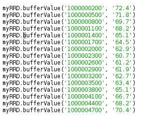
We notice three things: One, the times in the database do not equal the times that we sent to the database. The times in the database are still at the 300 seconds, exact, interval. Second, the first value in the database, 72.4 matches the first value sent to the database. Third, none of the other eleven values in the database match the values sent to the database.
Let's try to analyze how RRDtool decides what values to put into the database. The next code, sends measurements at times either on, before, or after the exact interval. There is one measurement that falls right on the heartbeat definition, and one measurement after the heartbeat. To make it easier to generate a visual representation, I am making the "steps" 10 seconds, and the heartbeat 15 seconds.


I would expect a linear interpolation to be used to determine the values in the database. For example, the value at time 1000000010 to be determined by drawing a line between the value at 1000000007 and 1000000022 and seeing where it crosses the 1000000010 line. That value would have been 3/15*(69.7-71.8)+71.8=71.38. The value in the database is 70.495 not 71.38, so it is obvious linear interpolation is not used by RRDtool.
In my graphic "Computing the Values In the Database", I indicated where the value in the database (black numbers) come from, but not the rational for why the various mechanisms for computation were used. Are the rules and algorithms those for IT? I'm not a mathematician or IT person so I don't know. Please feel free to supply a little insight here. I won't analyze these results further but would advise you to report all measurements at the times that exactly match the chosen "perfect" intervals. If a measurement is missed it would be better to repeat the previous measurement than to report nothing.
Graphing The Results
OK We're ready to discuss the graphing - the fun part. One word to mention up front is that all of the functions to be discussed have many optional parameters. I'll discuss those I think to be the most important, but by no means all. The function graph has one mandatory parameter and 35 optional ones with default values.
DEF, CDEF, and VDEF Functions
Of these three functions only DEF is mandatory. I used DEF and VDEF for the sample graph.
DEF means Data Definition. This function links the database file and the Round Robin Archives to the graph. It takes takes four parameters:
rrdfile: The file name, with its path, of the database file.
vname: An arbitrary name. You can use this name in later definitions. This name will become equal to the file name in rrdfile.
dsName: Data Source name. The same dsName you specified when setting up the database. Line 38 for sensor 1 in my code.
cdef: This is not the same as the function CDEF. It has the default value of "AVERAGE". I will be graphing the "LAST" values from my Round Robin Archives so I must specifically specify "LAST". The value in dsName will become equal to the value in cdef.
CDEF means Calculation Definition. CDEF works on each data value in your database. I have not used CDEF in the code above but I will show an example where I convert the values from Fahrenheit to Centigrade. You can also use CDEF to make decisions. I'll show an example where I use it to plot different colors if the temperature is above or below the average temperature. Neat stuff. CDEF takes two parameters: vname which is an arbitrary name you can use later to refer to the calculation defination, and rpn, the calculation formula.
All of the calculations in CDEF and VDEF are done using Reverse Polish Notation. That is what the rpn stands for. When HP sold scientific calculators using rpn, I avoided purchasing one just so I would not have to learn Reverse Polish Notation. Now, all these later, I have to learn it. Good Grief! Anyway, it's not too bad. There is an excellent tutorial on the RRDtool website
VDEF means Variable Definition. This is used to calculate a single value based upon all of the data you are using from the database. My graph uses it do draw the continuous lines that represent the average of the database data values. I also use to print those values below the graph.
VDEF has two parameters, like CDEF: vname and rpn. The VDEF calculations in rpn are limited to LAST, AVERAGE, MAXIMUM, MINIMUM, and PERCENT.
LINE, AREA, and TICK Functions
LINE obviously draw lines on the graph. For each sensor, I have two line definitions, one for the data points (lines 99 and 107), and the other for the average (lines 102 and 110). The LINE function has six parameters, all of which have default values:
width: Width of the line. You can specify a floating number. I don't know if this is in pixels or what.
value: Use this if you wish to draw a continuous line at some value parallel to the X axis.
defObj: This important parameter controls what data you draw. Use the variable name derived from the DEF, CDEF, or VDEF functions. I use the DEF choice to print the data, and the VDEF choice to print the average line. If I were to do some calculation on the data using CDEF, I would use the CDEF choice. You will see this later.
color: If you don't specify a color, the line will be invisible. Color is specified using Red, Green, Blue or RGB. The first two hexadecimal digits are red, the next two are green, and the last two are blue. 00 means the color is missing, FF means the maximum value of that color. My line in code line 99 is green.
legend: Under the graph itself, you see four colored squares with some text. The text is what is specified in legend
stack: If you make stack=TRUE, then the values in this line will be added to the values in the previous line. I don't know when you would use this.
AREA draws a solid colored area from the X axis to the database value. It takes the same parameters as LINE. My sample graph does not AREA, but I will discuss it later.
TICK: This one is strange to me. I'm just going to copy the documentation in the function definition:
Plot a tick mark (a vertical line) for each value of vname that is non-zero and not *UNKNOWN*. The fraction argument specifies the length of the tick mark as a fraction of the y-axis; the default value is 0.1 (10% of the axis). Note that the color specification is not optional. I'll show an example of this. It's not worth mentioning further.
GPRINTS and COMMENTS
GPRINT or Graph Print. The next line up from the last line on the sample graph show the usage of two GPRINT statements. This is useful for printing some variable along with text. The variable in this case is the average value of the temperature measurements for each sensor. GPRINT takes two parameters:
defObj: This tells where the variable number comes from. In the case of my sample graph, the values come from the VDEF definitions.
format: This parameter contains the text you want to print on the graph including a formatted reference to the value in defObj. In my graph, this is the "%6.2lf". Please note the character between the "2" and the "f" is not a "1" (one). It is an "l" (el). This means we will print a value with two decimal places that will take up at least 6 total character places.
COMMENT: The last line on the graph is a comment. The function has two parameters, the text itself and autoNewline. autoNewline has a default value of TRUE. I haven't tried making this FALSE.
Some characters have to be escaped with the "\" character. According to the function definition the ":" character must be escaped, I don't know what other characters. The space character does not have to be escaped here. In other parts of the graph, the space character does have to be escaped. I used the escape character to start the comment with a tab ("\t").
Color Attributes
This useful but optional element really jazzes up the graph. This allows you to control the color of nine elements:
back: Background. The area surrounding the graph's grid. Solid black in my example.
canvas: Canvas. The color behind the graph's grid. Dark gray in my example.
shadea: Left, top border. A line along the top and left side bordering the graph. Too light to see in my example.
shadeb: Right, bottom border. A line along the bottom and right side bordering the graph. Too light to see in my example.
mgrid: Major Grid. Color of major grid lines, minor grid lines are darker. Light gray in my example.
axis: X and Y axis. White in my example.
frame: I don't know what this is.
font: Font color. White in my example.
arrow: Color of the arrows at the ends of the X and Y axis. White in my example.
Finishing Up
After the import command, code line 136, we give the path and name of the file that will hold the graph. This will have a .png extension.
Next, we establish a variable, "g" in the case of our sample graph, and pass it more information. The "Graph" function has only one parameter you must supply, and that is the name of the graph file. In addition, it has 35 parameters with default values, so you only have to assert the ones you wish to change. I have included seven of the 35 here. Note the "start" time is one minute before the first measurement is reported. This assures the first measurement will be plotted. Notice also that the space must be escaped in the "vertical_label" and in the "title". Without the escape you get an error if you include the space. Before I figured out the "\ ". I replaced the space with the underscore character. Some of my graphs that follow will have the underscore.
Next we pass all of the variables we established earlier, the variables made from the DEF, CDEF, VDEF, LINE, AREA, GPRINT, COM, etc. We make a list of all of these variables and send them to the "g" variable. See lines 140, 141, and 142.
The order of the items in the list is important. It establishes the order of what is drawn on the graph. The GPRINT variables must follow any line, area. or tick because they are included after the plotting. The comments must be the final item in the list because comments are included at the very bottom. If you put GPRINT or COM variables earlier in the list you will throw an exception.
Finally, we issue the g.write() command and the graph is made.
Controlling The Graph
There are many items you can not control. You can't place a comment at the top, for example. Theoretically, it is possible to control the start and stop values of the X and Y axis. There is a GraphXGrid and a GraphYGrid function. The GraphXGrid function documentation basically said it is difficult to change the grid.
The number of grid lines, both major and minor are determined by the data and the size of the graph. Change the width and height in my code line 138 and you will get more or less gradations. The positioning of the legends under the graph are controlled by RRDtool. You do control the order by the order of the items in the list you provide to the variable "g" (in the case of my code).
You don't control how the time below the X axis is displayed. My sample graph shows hours, in 24 hour format, followed by minutes. If you data is taken over many days, or months, or years, RDDtool will adjust accordingly to its rules.
More on CDEF

The graph above shows the temperature now plotted in Centigrade Rather than Fahrenheit. Most of the changes are shown in the code following the graph. For brevity, I've only shown the changes to sensor 1.
Line 2 is new. It uses the CDEF function to apply a calculation to each temperature value in the database. The calculation is defined in the "rpn" parameter. The calculation is the formula C = 5/9*(F-32), but in Reverse Polish Notion. We do this rpn calculation from left to right. For each database value, we put put values on the stack until we reach an operator sign. Therefore, the database value and the number 32 go on the stack. When the "-" operator is reached, two values are removed from the stack (in this case emptying the stack) and subtracted from each other. That resulting value is put on the stack along with the number 5. When the "*" sign is reached, those two numbers are removed from the stack and multiplied. The result and 9 go onto the stack and removed when "/" is reached. The last result is divided by the 9 to produce the final result.
Notice, in line 3, that plots the line of data, defObj now refers sen1_cdef not sen1_def. Likewise, in line 5, rpn='%s,AVERAGE' % sen1_def.vname, is replaced by rpn='%s,AVERAGE' % sen1_cdef.vname
Printing Areas Instead of Lines - Bad Example

You can replace the lines representing the database values with solid, colored, areas as shown in the plot above. I changed some of the database values for sensor 2 so some of them will be less than the values of sensor 1 at the same measurement time. I also made sure I plotted sensor 2 before sensor 1. This was done here:
g.data.extend([sen2_def1, sen2_area, sen2_aver, sen2aver_line])
g.data.extend([sen1_def1, sen1_area, sen1_aver, sen1aver_line])
As you can see, the second area plotted can cover some of the plot of the first area plotted. If I had plotted sensor 1 first, the green area would only be visible for four measurements. As it is, since I reduced some of the sensor 2 values, below sensor 1 values, four of the sensor 2 values are lost. This is not a very good use of areas.
Printing Areas Instead of Lines - Good Example

The graph above illustrates plotting useful solid areas. And, it illustrates the use of the IF statement to make decisions, in Reverse Polish Notation. For this graph, we are only printing from sensor 1. We will print the area in green if the database value is below 66 degrees. If the values are above, we print the area in red. The important code changes are shown below the graph.
Only code lines 9,10, 16, and 17 are new. Lines 9 and 10 use the CDEF function to do calculations while lines 16 and 17 use these calculations to define the two areas. We will look at the calculations in the "rpn" parameters. Here we are making decisions and applying those decisions to the data.
Let's look at "66,Sen1data,GT,Sen1data,0,IF" and see what is going on. For every point in the database we compare the database value (in Sen1data) to the number 66. If 66 is greater than the database value, the result is 1, otherwise, 0. Next, finding the "IF" at the end, it says that if the value is 1, the result of the calculation is the database value, otherwise it is 0. This result is passed to the AREA definition in line 16, which defines a green area on the graph. You can see that only between 11:50 and 11:59 will the values be below 66. The second area that plots a red uses the calculation in line 10. Here the calculation is "66,Sen1data,GT,0,Sen1data,IF". In this case, again, if 66 is greater than the database value, the result is 1, otherwise 0. Now, however, if the value is 1, the final result is 0. If the result 1s 0, the final result is the database value. This calculation results in the red area defined in line 17.
If the value is exactly 66, it will print green. If I wanted to have it print red, I would use LE instead of GT and rearrange things. My real intention was not to use a discrete value like 66. I wanted to use, instead, the average value, which is calculated in line 8. My attempt to do that is what is in the commented out lines 12 and 13. I played around with this for some time, but everything I tried resulted in an exception. Unless, I did not hit on the correct solution, I can only conclude that you can only use one variable in the "rpn" calculation. Too bad!
Finally, I really wish I could have changed the Y axis and have it start from some other value besides 0. I tried replacing the 0 in the rpn expressions with 50. The final plot was a mess. RRDtool decided not to start the graph at 50, but at 40 instead. What I got was a plot that was red from time 0 to time 11:50. From 11:50 to 11:59, the plot was red from 40 degrees to 50 degrees and green from 50 degrees to the database value, then red to the end of the plot. I don't understand this at all.
That's All Folks
Hope this is worthwhile. Happy plotting.
Back in June and July I presented a series of posts titled, "A Raspberry Pi Thermometer". My next project will be to update that project useing RRDtool and PyRRD to plot the temperature readings. Stay tuned.